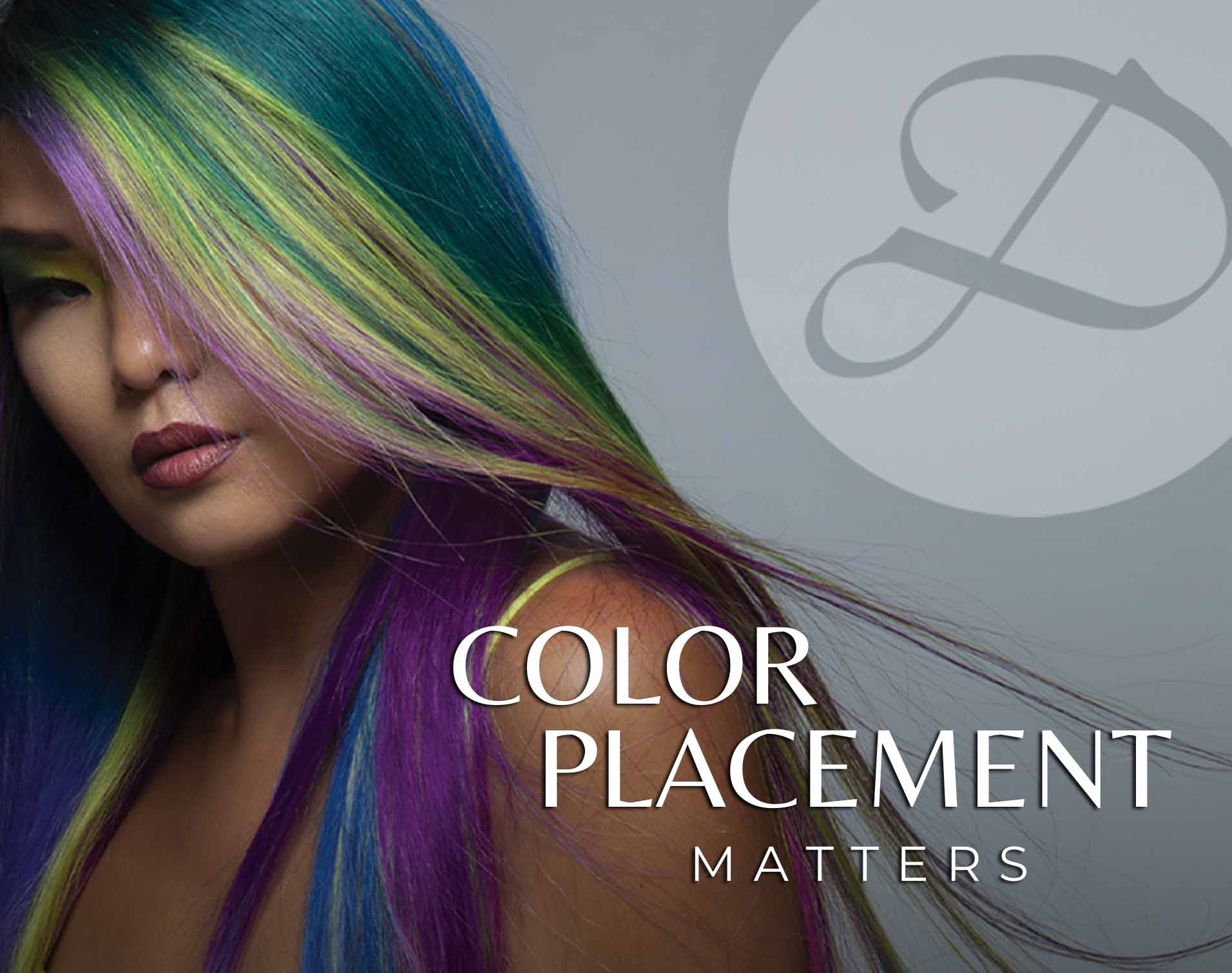
Why Hair Color Placement Matters More Than You Think
Inspiration from Pacific Northwest Color Palettes
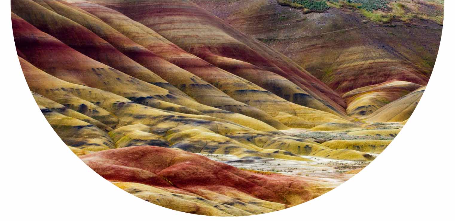
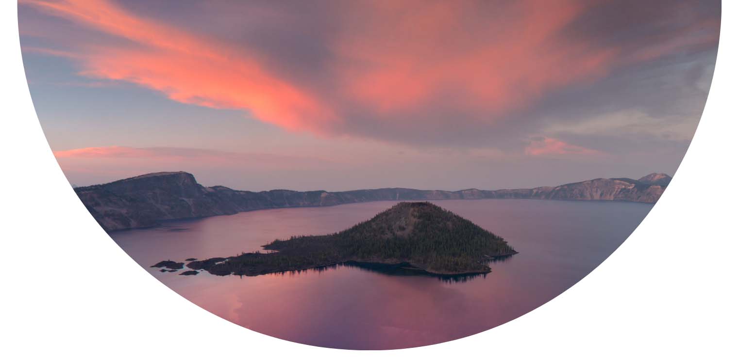
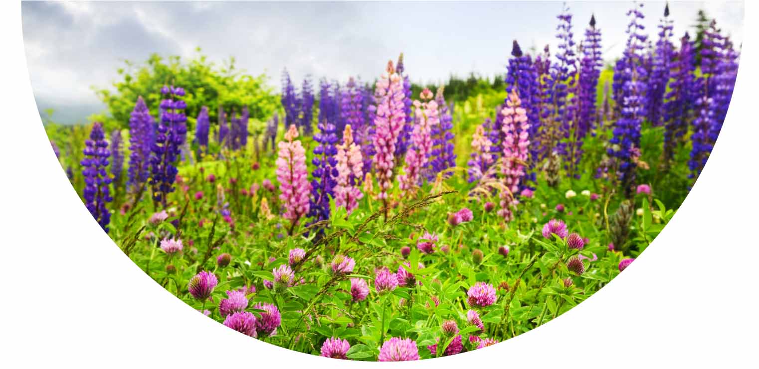
We pulled our core hair color palettes from three iconic landscapes in the Pacific Northwest: Crater Lake, the Painted Hills, and the vibrant wildflower meadows found deep in the forest. These landscapes inspired our hair color design and placement choices.
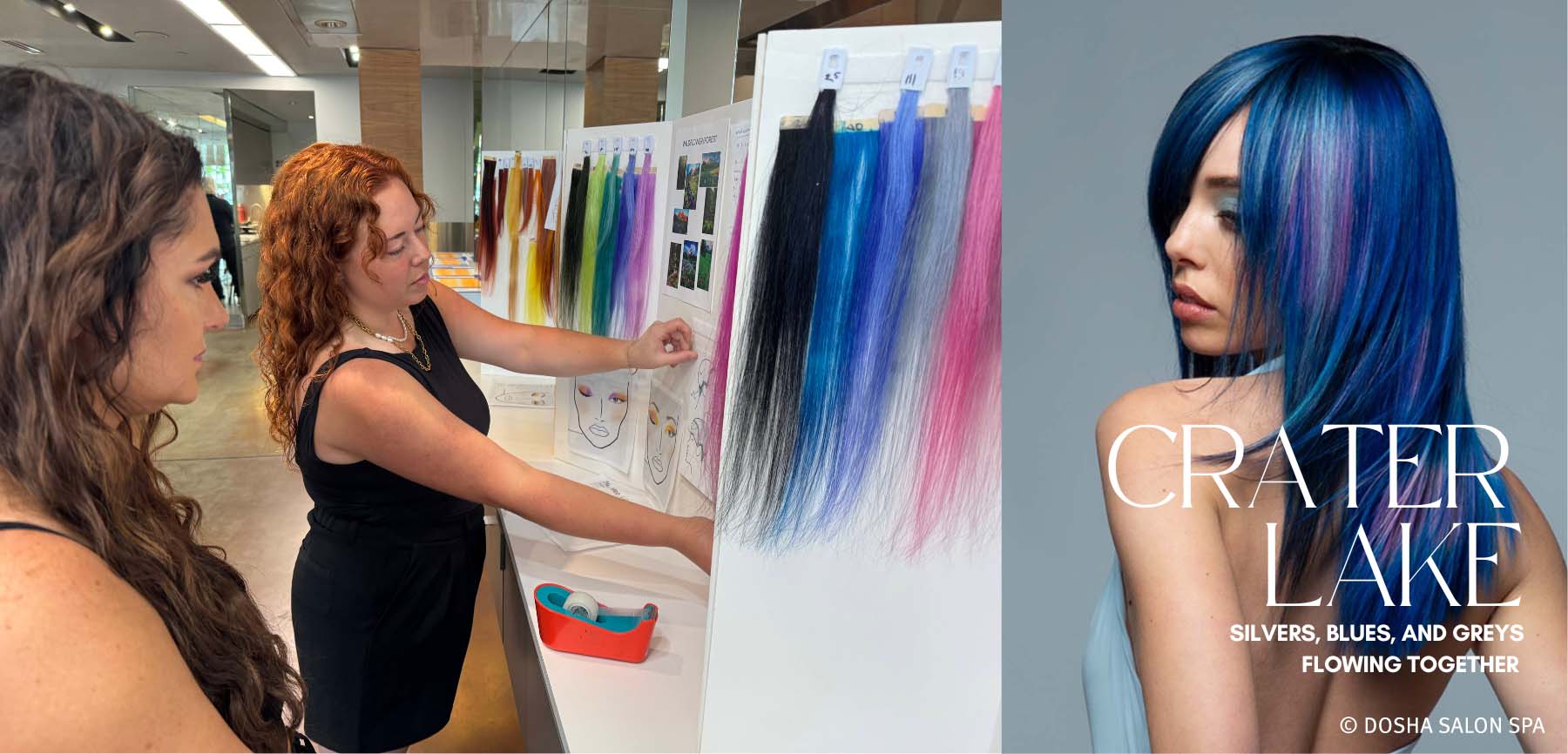
Each tone was meticulously formulated to reflect the colors of the landscapes. A useful hair color technique we relied on was smudging the Aveda Vibrants formulas onto white paper to preview how they'd appear on pale yellow hair; simple, quick, and surprisingly accurate.
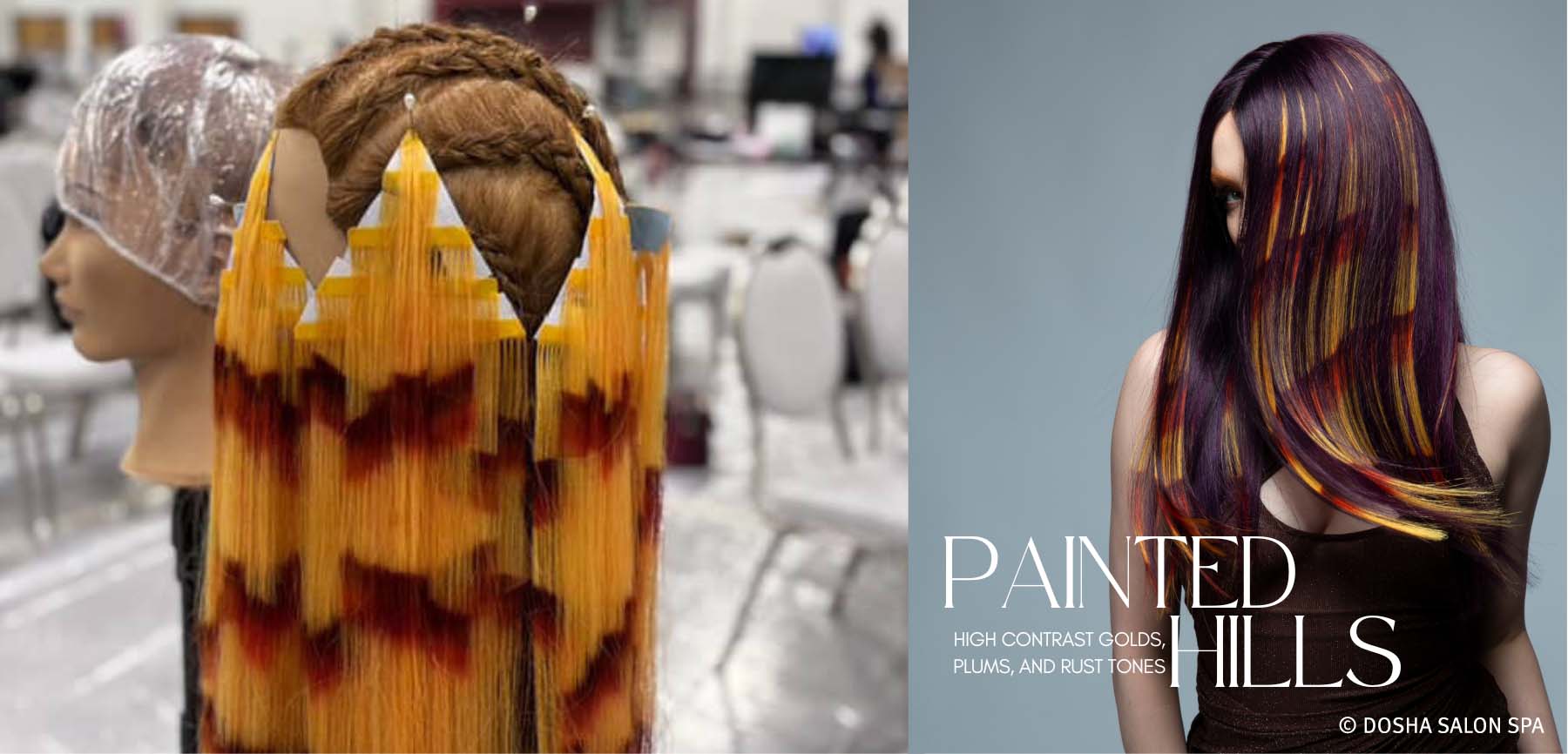
Painted Hills
Rich rust, ochre, plum, and golden earth tones
Crater Lake
Varying blue hues, sunset pinks and corals
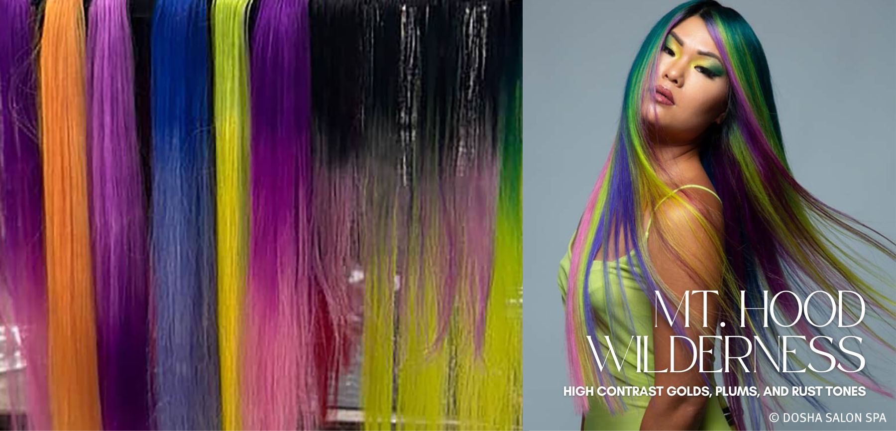
Wildflower Meadows of Mt Hood
Vibrant greens, yellows, pinks and purples
Quick Tip: When prepping extensions, we dip-dyed them with Liquid 5 Volume and a touch of tone. This helps remove synthetic coating and ensures even color absorption for more vibrant hair color results.
Understanding Shape and Direction in Placement
Hair color placement is about more than applying beautiful color—it's about how and where you apply it. The type of block placement plays a specific role in the visual impact of the overall hair color design.
Circular or Oval Blocks
These create a soft focus effect, especially on layered cuts. Without hard edges, colors transition naturally into one another, ideal for melting similar tones together.
Used in: Crater Lake Collection with silvers, blues, and greys flowing together without clear breaks—showcasing seamless hair color techniques.
Triangular Blocks
Perfect for high contrast accents. Depending on placement, they can mimic the look of ribbons, beams of light, or sharp gradient transitions.
Used in: Painted Hills Collection with high contrast golds, plums, and rust tones applied to mirror geological striations—demonstrating bold hair color design choices.
Rectangular Blocks (Vertical or Horizontal)
Best for maximum contrast and high visual impact. These placements read as bold statements on both straight and textured hair. Horizontal slices showcase dense color blankets. Vertical placements elongate and add drama.
Used in: Wildflower Collection with floral hues placed vertically over deep greens for vibrant contrast and impactful Aveda color placement.
The Takeaway on Placement
This collection showcased how powerful shape and direction can be when used intentionally in hair color placement. Placement should never be an afterthought—it’s what determines whether a beautiful formula becomes a beautiful result.
Think of every section, every block, every angle, as part of the bigger picture. When thoughtfully executed, placement becomes the bridge between formula and impact, elevating vibrant hair color into true artistry with Aveda.
Watch Master Stylist Kristina Paris as she shares her insights on creating movement, texture, and vibrant color magic in every strand.
Ready to see color placement in action? Make an appointment with one of our stylists.
![]()
Meet the Dosha Creative Team
| Kim Botner is a Dosha Master Stylist and our Creative Director. Check out Kim's Instagram @kimbotner. |
| Master Stylist Kristina Paris. Check out her IG @kristinaparishair. |
| Master Stylist Hannah Rose. Check out her IG @hairbosshannah |
| Master Stylist Jessica Watts. Check out her IG @jesswattshair |
| Master Stylist Doza Barcelona. Check out her IG @dozabarcelona. |
| Master Stylist and Makeup artist Kayla Jones. Check out her IG @kaylajay_artist |
| Master Stylist and Makeup artist Juliana Morton. Check out her IG @juliana_pdxartist_stylist |
Share
Recent Posts
Monthly archive
- May 2026 (1)
- March 2026 (1)
- January 2026 (1)
- December 2025 (1)
- November 2025 (2)
- September 2025 (1)
- March 2025 (2)
- January 2025 (2)
- November 2024 (3)
- September 2024 (3)